Tuesday 9 December 2014

Exam Representation Case Studies

Film Trailer - The Inbetweeners 2

- Comedy

- Characters represented as students who don't really fit into any social groups

- A negative representation of age as their main focus is sex, sun and booze

- Language used by the characters is simplified - representation of how young people talk (negative)

- The characters' behaviour can influence how their audience feel toward the subject of the film

- The film's target audience can also relate to this - the majority of the film's audience is within this age range so they will be able to relate to the things they are doing

- The characters have individual personalities which can represent age differently: a liar, the dumb one, the smart one and the loser. These individual personalities can be relatable to different people

- The idea that teenagers, or 'inbetweeners', just want to party abroad is massively portrayed throughout the whole film as it is the underlying theme.

- Majority of the jokes in the trailer are surrounding the topic of sex - represents young people negatively as this could mean this is all they talk about


TV Programme - Sun, Sex and Suspicious Parents

- Negative representation of teenagers on their first holiday with their mates and without their parents

- Parents are chosen specifically so a good programme is made - for example in season 2, episode 1, jehovah's witnesses are chosen as parents as it makes a more interesting reaction when they find out what their children have been doing.

- Introducing the lads - they are in a pub drinking, stereotypical place to be for 18-19 year old lads

- A scene where he asks for his mum to cut his toenails for him while he's in the bath, negative representation as it tells us he can't do anything by himself

- Packing his bags scene - his mum has already bought things for him that lads at this age are expected to get themselves, e.g. condoms

- Son seen playing around and taunting his dad, can show a negative representation of his relationship with his dad and this could be generalised to a wider representation of teenage boys in the country although it may not be true

- The boys doing shots at 4am in the morning - negative representation of lads as they feel the need to drink as soon as they depart

- Montage of teens going crazy, partying, drinking and generally being sexual with each other

- Girls group filmed doing laughing gas - negative representation of cheap thrills and highs

- One of the lads filmed getting nude in a club and getting kicked out - negative - lack of responsibility and maturity

- Constructed reactions between parents as they are so different

- Mid way through interview one of the girls is sick - this isn't cut out of the programme because the producers want to leave this negative representations of immaturity and informality


Advert - Shreddies Cereal


- Old woman - key aspects: grey hair, glasses, cardigan, pearl necklace

- Representation that old women, particularly grandmas, can and do knit

Thursday 27 November 2014

Production Research Analysis

Production Research Analysis


In this example of a double page spread an image of a main character of the film that is being showcased. This is significant as it stresses the importance of the character and his role in the film. As this film has a formal theme the connotations that the theme, the layout and the fonts portray need to fit this theme. The character's attire in the image also adds to this formal atmosphere.

The fonts are clearly laid out and well presented to carry on the simple and uncomplicated theme. The character is set a distance apart from the car as it creates space for the page separation when printing. The rule of thirds has also been applied in order to make the layout more aesthetically pleasing to the audience. The empty space above the car is suitable as it allows space for the text. The colour scheme is neutral, the black suit synergises with the black text and it continues the formal theme. The main character being in focus also allows for him to be the focal point.

The text is separated cleanly and is all aligned where appropriate, therefore continuing the formal and clean theme. The slight italic font on the title can portray connotations of significance and therefore the audience will look at this immediately and think it portrays some sort of importance. The use of language can also be important as it can appeal to the audience. The repetition used in the title can also appeal to the audience, "something old, something new."


This is clearly a more detailed double page spread and this is because it is talking about the film in more in depth detail. The previous double page spread is simply showcasing the film whereas this one is talking about the plot and how the film was produced. The layout is less clear than the previous one as more information needs to be displayed. This issue contains a list of the top films, with Skyfall being number 1. The rest of the list continues on the side of the second page. They are all numbered but numbers 1, 2 and 3 are portrayed with some sort of significance as they are the focus of the list.

The second and third place films are briefly reviewed in proportion to their significance in the list. Brief evaluations and reviews of the films are displayed underneath their names and an image of the actors or a screenshot from the film. Skyfall has the number one place therefore it is showcased the most, the biggest image, the most text explaining the film and its production and therefore the most space on the page is taken up for this film. 

Friday 14 November 2014

Research Analysis

Research Analysis

My research has helped me work on my pre-production in a variety of ways. The main feature I needed inspiration for was the layout of the magazine. I chose to base my magazine layout on the magazines I had researched as it provided me with adequate information on what audiences like. As I wanted to target a an audience within the socio economic groups C1 and B. My research on filmmaker magazine provided me with ideas of what different varieties of audiences like, for example a more neutral layout is preferred for a higher class audience. The main image was a struggle to replicate in my magazine covers as most of the films being showcased on the front of these magazines were extremely high budget, famous blockbuster films. I had to improvise on the main image and hint at what the film could be about with the colour scheme, appearance of the main image and the cover lines. The language used in the cover lines would also tell the audience about the film. I struggled to create short and snappy, yet informative cover lines. I wanted them to inform the audience about the film and the content of the magazine but also not take up too much space and aim to invite the reader.

The data I got from my survey also helped me as I found out what the audience I am aiming at liked in a magazine and what they were interested in film. By asking the participants' age and a variety of questions about how much they are willing to spend on films I could take from this what socio economic grouping the audience will fit into. I can also find out how much the focussed audience enjoy films and how interested there are in them. I based my idea for my magazine covers mainly off Empire magazine. I used this magazine brand as I felt it portrays the showcased film the most clear out of the magazines I had studied. I also felt the information and colour schemes were all interlinked and I felt these were the most effective in persuading me to read the inside content. I also thought the imagery for these magazines could be simplified but still portray the same message. From researching these magazines and comparing what I had done to them I could find imperfections in my work and correct them. A deeper analysis of the magazines allowed me to pick out conventions in the main image as well as the cover lines and masthead. An example of this would be the main image in my first magazine cover, I took this image basing my ideas off magazines I researched. When shooting the image I had to take into account everything down to the stance and the facial expression of the subject. Many images were taken and the final one was the best out of the bunch.

Wednesday 22 October 2014

Survey Data Analysis

Survey Data Analysis

Q1 - How old are you?

All of the participants of my survey were in my media class, this meant the results for this question would be the same as the age range doesn't exceed the boundaries of the question. In the future I may need to gather more results so I can depict what effect age has on the later questions. This question could also give me an idea of what socio-economic group the audience would be in and what that specific group likes. This means I can play to the strengths and focus on the most popular elements of film when producing my magazine.

Q2 - What is your preferred genre of film?

Each response was different for this question as people have varied opinions on their favourite genre of film. I think this is significant as it allows me to include a range of different films in my magazine. The problem I have with the amount of responses is I don't know which is the most popular genre so I don't know which to focus on when producing my magazine.

Q3 - How many times a month do you visit the cinema on average?

The responses for this question were varied. 66% of participants answered 1-3 and the other third told me they visited the cinema 0 times a month. This could give me an idea of how popular the cinema is and how I should focus on the aspect of cinema when producing my magazine.

Q4 - How many movies do you watch per week?

100% of people told me they watched from 1-3 films a week. This tells me people prefer to watch films at home rather than the cinema. This could mean including aspects of home cinema in my magazine as people may be more interested in this.

Q5 - What is your favourite film?

This question is to purely involve the reader in the questionnaire, inviting them to proceed. By including a personal response this gives me the option to include specialist films. The only problem with this is I don't have enough responses in order to find out if people have the same taste in films.

Q6 - On a scale from 1 to 10 (10 being the most) how interested are you in films?

This question provides a backbone to my production as it tells me how interested people are in films. If more people from varied age ranges were to answer this it would give me an idea on what age range to focus on and therefore how to structure my magazine. 100% of answers to this question were at the value 8 which tells me the people in this age range that answered this question were interested in films.

Q7 - What film magazine(s) do you read, if any?

The answers to this question provide adequate information on how popular film magazines are in different age ranges. This is effective in my research as it also tells me which age range to focus on, therefore how to structure my magazine. 100% of people answered 'None' for this question. This is significant because it tells me how big of an audience I would attract if I focused on that age range.

Q8 - How much on average do you spend on films per week?

As the responses for the cinema question were similar to this one, these answers could be predicted. Some answers may vary due to extraneous variables, for example people may buy DVDs to watch films or they may watch them online. 100% of people answered £0-£5. We know they don't visit the cinema so I expected these answers.

Q9 - Where would you rather watch a film?

This question may tell us why people don't like visiting the cinema. The results tell us two thirds of the participants prefer watching films at the cinema rather than at home. This could be significant because people may not want to spend money in order to go to the cinema, they may also not have the money to spend. These results may vary if varied age ranges took part in the questionnaire as people with jobs may visit the cinema more often as they will have money to spend. This also may be disproved as people with jobs may not have enough time to visit the cinema.

Q10 - Do you have a favourite director? If yes, please specify.

The issue stands with this question as there aren't enough responses to evaluate fully. A more mature audience may read film magazines as they may be interested in different things. If a more mature audience were to partake in the questionnaire then I think there would be more results. 100% of answers for this question were 'No.'

Tuesday 21 October 2014

Textual Analysis - Filmmaker Magazine

Textual Analysis - Filmmaker Magazine


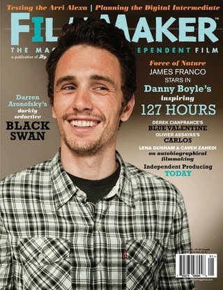
This magazine cover can portray mixed connotations as, amongst other things, the colour scheme and the main image are relatively neutral. First of all, the main image is a photograph of actor James Franco. Franco's attire includes a checkered shirt and a simple, black shirt underneath. These items of clothing can portray simplicity and a neutral atmosphere. This may be because the producers of the magazine may want the audience to focus on the text. The facial expression of Franco in this image is also significant as he is smiling, suggesting the neutral theme once again.

The way Franco is looking can also have some significance as he could be looking toward the text, encouraging the audience to read it as it is clearly the focal point. On this occasion the person in the main image is not making eye contact with the audience as the cover lines are significant in explaining the main content of the magazine.

The masthead of the magazine can be seen as childlike as the font is clearly not formal but it could also portray connotations of creativity. The colour scheme also blends with the colours used in fonts further down the magazine in cover lines. These colours of the fonts stress significance of their meaning, for example the name "Danny Boyle" and "127 Hours" are in the same colour and font as they are linked. The word "inspiring" is in a different, less significant font as it is purely describing the film. The size of the font can also portray meaning as it can stress significance; the larger the font, the more significant the language.

The cover lines are all placed around the main image; none of them invade the image as it can disrupt the effect the image is trying to portray. The image is aligned using the rule of thirds as it is the most effective way of displaying an image that is most aesthetically pleasing to the audience. This also allows room for the cover lines in the empty space. The barcode is also situated at the bottom right corner of the cover as this way it is positioned out of the way and therefore it doesn't disrupt the main image or the cover lines.

The socio-economic group for this magazine may be placed at around C1-A as the magazine is priced higher than the rest I have analysed and can be seen as formal compared to them. The price of this magazine can be as high as £5. This suggests the magazine is designed to attract a more formal and sophisticated audience.

Friday 17 October 2014

Textual Analysis - Total Film

Textual Analysis - Total Film


This Total Film magazine cover showcases the film "X-Men: Days of Future Past." This is evident not only because it states it in the cover lines but more obviously the main image. In this case the masthead of the magazine is behind the main image. This is usually the case but in the last analysis the magazine was a special edition so it was different. The key theme to this cover is that everything is central. The masthead, the main image and all of the cover lines are central; portraying connotations of formality and seriousness.

The use of dark colours also stresses this dignified theme. The facial expressions of the actors in the main image also express this as they are all looking toward the audience; with the exception of one on the left. This has some significance because it briefly explains how the characters will behave in the film. We can take from this that the character on the left has some significance as he is different to the others.

The cover lines are all situated at the bottom of the cover, this is due to the fact all of the characters in the main image are important and therefore we need to see their attire and body language. The cover lines are used to persuade the reader to read the magazine and question what is inside. The font scales with level of language importance.

A good example of this on this magazine would be "Future 100" as it ensures the audience will see it and therefore they will question it. The use of the enigma code will ensure the reader is invited to read it. The bright white font is bold and clear to ensure it can be red with ease. If it wasn't that clear people would be put off and wouldn't be as intrigued.

The language used is also significant because of the affect it has on the audience. An example of this on this cover would be "your essential preview to everything that matters in movies." If someone who is interested in film reads this they will feel the need to read it as they believe it is "essential" and they will want to know "everything that matters in movies." This clever use of persuasive language encourages the reader to purchase the magazine.

The colour scheme for this cover is significant because it is consistent throughout and it can portray connotations of clarity but also high ranking. It also blends with the characters' attire. Four of the five characters are wearing black clothing. The reason for the fifth character, the one on the left, not wearing black relates to his role in the film. He is the different character, he acts differently and we can extract this from the front cover.

The socio-economic grouping for this magazine may be placed at C1 up to B as the price can be set around £3-£4 for this magazine on average. We know this range in the socio-economic grouping would be suited for this magazine as these are the people that would be willing to spend this amount on a magazine. We can also tell this as the language used could be quite advanced. The only problem with this summarisation would be some of the audience may fit into the C2 - D grouping range as the magazine may be bought for them but they may have an interest in it. 

Thursday 16 October 2014

Textual Analysis - Empire Magazine

Textual Analysis - Empire Magazine


This magazine cover is a prime example of a magazine that captivates and invites it's audience. The masthead for this magazine differs from others as it covers the main image; mastheads usually sit behind the main image. This could be because title isn't as well known as others such as GQ or Vogue but it could also be because the magazine needs the promotion as it is not as popular as others. The striking, bold red font portrays connotations of importance of the magazine. The font is not formal but it also isn't informal, it is a neutral medium in-between. The theme of this magazine is set by the content; the film "Tron Legacy" is being showcased. This has resulted in a change in font at the top of the magazine. The colour and style of the font suits the film and this could promote the film further.

This brings me to the main image; in this case it is one of the main characters in the film. The character is played by actor Jeff Bridges. The image is central and eye contact is created with the audience. This could create a bond between the audience and the character in the main image; therefore inviting them to buy the magazine. The facial expression of the character in the image could also portray the message of the film so we have a slight idea of the genre without having any prior knowledge to the film.

We can clearly see the film is not a comedy due to the formality and the colour scheme; the colours could suggest sci-fi. The choice of actor to put on the magazine cover is significant as it could suggest the level of formality for the film; an older figure could portray connotations of wiseness and knowledge. We can also take from this the character's role in the film. The enigma code is used here to ask the audience questions about the film, they will question what is going on and therefore they will either want to buy the magazine or watch the film.

The cover lines are evenly spread around the main image so that information about the content of the magazine is addressed but the main image is not covered to the point that it cannot be seen properly. The font used is the same as the masthead as this continues the formal yet creative theme of the magazine. The colours of the fonts are significant as they capture the reader's attention as they are bright and vivid but they also fit the colour scheme of the film. The yellow font could alarm the reader and invite them to read the heading and therefore encouraging them to continue reading. The language of the cover lines needs to be concise but it also needs to persuade the audience to read on.

Certain information is given but it is used in a way that it ensures the reader questions it. An example of this on this magazine cover would be "How was your 2010?" By addressing the audience directly in a way that ensues conversation can make them think about the question in hand. This creates a bond between the audience and the magazine as it is almost like they are having conversation. Language like "The ultimate guide" and "magazine of the year" can promote the magazine and once again persuade the audience to read on. The inclusion of well-known celebrities names such as Johnny Depp and Angelina Jolie can motivate people to read about them as they are interested in the films that they star in.

The socio-economic grouping of this magazine can be difficult to analyse as there is a wide age range that could be targeted. The price of the magazine is not displayed but the average price for Empire magazines is around £3.59. This could put the socio-economic grouping for this magazine at groups C1 and above; up to B as group A may be interested in higher quality magazines.

Survey Monkey - Film Magazine Survey

Survey Monkey - Film Magazine Survey


https://www.surveymonkey.com/s/2BJMD2R 

Friday 10 October 2014

Examples of Representation in the Media

Examples of Representation in the Media

This is an example of the upper class in the media. In the image we can see the UK leaders being portrayed and represented as being powerful. In the image we can see they are well dressed and well groomed. This gives connotations of responsibility and formality. This was found on the homepage of BBC News, meaning this is one of the most important topics at the time in this country. The facial expressions of the men in the image gives the reader an idea of what the topic is about; issues in the governing of the country. This is a positive representation of men in the media.


This is one representation of men in the media, the programme Insane Fight Club. Found in the category TV on the BBC website, the image shows 3 men who are involved in a fighting club and subculture. The image shown gives connotations of crazy and mad men. The clothing they are wearing in the image is all black and the men can be seen wearing tattoos. These features also give connotations of insanity. The programme represents the men in a negative way. They are portrayed as crazy and the people involved are portrayed as crazy and mental. Warnings are displayed before the show telling the audience that there is strong language and scenes "you may find upsetting." This is then followed by a sarcastic comment about the fighter's sanity, this is used because it amuses the audience but it also gives them an idea of how the men behave in the show.


The film Lucy includes actors Scarlett Johansson and Morgan Freeman. This is significant because they are two contrasting people. Morgan Freeman is a black, older male and Scarlett Johansson is a young, white female. In the film. The scientists are all male and they are all older, this could be a stereotype towards scientists. Johansson is portrayed as a white, blonde woman in her mid twenties at the beginning of the film, her dress sense is casual throughout the film. This is important because people may connect and relate with this; making the film more believable. Another reason why Johansson may have been selected for this role is because she has been voted sexiest woman alive for the second time by Esquire. This could also be another marketing technique as there could be shots in the film that could be revealing; this would encourage people to go and see the film. Another that Morgan Freeman was chosen to play the part of the scientist could be how he is older and this could have connotations of being wise.


South Park stereotypes race very much so. Comments are made by the characters in the show that could be deemed racist but manage to remain in the boundaries of social acceptance. Strong stereotypes are made in the show, especially those toward race. None of the main characters are black and few other characters in the show are black but when they are shown in an episode they are scripted to make comments which could offend. An episode titled "Chef Goes Nanners" includes the black character Chef and his protest against the South Park flag because he thinks it is racist. This episode could have deeper meaning and could be in response to the audience of the show complaining about racism. The message behind the episode is that by pointing out racism it makes you racist yourself.


The programme My Big Fat Gypsy Wedding highly sexualises women and girls. No matter the age of the girls doesn't appear to matter to the families involved. Although this is how the girls are represented in the programme it doesn't mean that this is how they act. The programme highlights the negative side of the families and how they act but it doesn't include the positive side of what they say. Just because the girls are dressed like this and the way they behave it doesn't mean they don't have morals. Some of the girls, for example, save themselves for their husband. Someone who watches the show would not think this due to the representation of the girls. The things they wear, the way they behave on camera and the language they use doesn't portray this message. There is no doubt, however, that the women in the programme are highly sexualised in a certain way to gain an audience; this could also be a marketing technique.

Thursday 9 October 2014

Textual Magazine Analysis - GQ

Magazine Analysis - GQ


This magazine cover portrays connotations of formality and masculinity. Although Drake could be used to attract a female audience, the male audience could also aspire to be like him. Also the matter that Drake is a well known artist could attract a wide audience as they would like to read about him. By quoting one of his most famous songs "started from the bottom now he's here" the magazine relates to the audience. This is important because it could encourage the audience to read on. At first glance the magazine looks relatively formal but upon further inspection at the cover lines we understand that the age range could vary from late teens to early thirties. We can get this information from the language used, a "killer summer party" may relate to a twenty to thirty-year-old audience.

Drake is seen wearing bright clothing, the silver coloured top and the white trousers could signify cleanliness and spruceness. This could give the male audience something to look up to, something to aspire to be like. The wrist wear could signify wealth and prosperity; the watch is made out of gold and encrusted with what looks like diamonds. His necklace could also give these connotations. His facial expression could also portray connotations of friendliness and this could encourage the audience to feel at ease when reading about him; they feel he is more realistic and down-to-earth. 

The masthead on this magazine is portrays connotations of minimalism and clarity, however it can still be recognised as GQ fairly easily. The cover lines are neatly organised around the main image of Drake to signify the main image itself but to also portray connotations of purity while maintaining legibility. Eye contact is also made with the audience as it gives them a sense of involvement. Drake's body language is also casual, encouraging the audience to feel at ease at the sight of someone famous.

The slogan "look sharp - live smart" gives connotations of formality and wealth. This could also affect the audiences' opinion on the magazine as they may aspire to "look sharp" and "live smart." These are positive aspects that the audience may feel they need to live up to in order to be successful like Drake. The little details down to the fact Drake's shirt is tucked into his trousers gives connotations that he is smartly dressed ready for an occasion.

The socio-economic grouping this magazine's audience could be classed as would be from C2 to B as the average price is set at £3.99. This is significant because it tells us who can afford the magazine and we can compare this to the age range targeted. The cover line "50 under $50" could tell us that the audience is willing to spend up to $50 (£31) on clothes for the "best summer wardrobe ever." This can also tell us that the target audience could have a limited amount of money to spend on clothes.

Friday 3 October 2014

Textual Analysis - Vic Mensa - Down On My Luck

Textual Analysis - Vic Mensa - Down On My Luck

The opening shot to this music video is a tilt close up shot on the artist. The lighting is extremely low key as he has not started singing yet and the producer aims to keep him mysterious and undercover until he introduces himself. The second tilt mid shot establishes the location of a night club, the subject of this shot is a girl that looks directly into the camera. This eye-line match editing tells the audience the artist has made eye contact with the girl and therefore she has some sort of significance in the plot. Her body language and facial expression also contributes to this as she is smiling and standing in an attractive manner. She is also in focus as the crowd surrounding her are all out of focus; establishing the significance of her once again.


As soon as the artist starts singing, harsh lighting is set on him and him only as he is the subject. This is a close up on his face and upper torso as his actions aren't as important, the producer wants the lyrics to be the focus as they have deeper meaning. This creates a link between the plot of the video and the lyrics. The shot is a reverse tracking shot which shows the artist is heading somewhere, the audience assumes this is toward the girl he was looking at. Another reason the audience may think this is because the lyrics could be aimed at someone; the girl in this situation. The cuts between the shots are fast-paced as it sets the tempo of the song. This could also symbolise the thoughts that are rushing through his head quickly. Another zooming mid shot, which includes low-key lighting, is used to set the artist a distance away from the audience. The mise-en-scene is significant in this shot also as there are people surrounding Vic Mensa; suggesting he is lost in a sea of people that are not particularly important in his life. We read this message by the fact they are all out of focus.


Throughout the beginning of the video the majority of the shots used are tracking mid shots. This is because the main focus is Mensa and he is walking through the club in order to get to someone. We follow him on his journey because it gives us a sense of involvement and can portray the same feelings that he himself is feeling. The use of mid shots is significant because all the detail of the plot is established on the upper half of people; there are no details that need to be portrayed on the bottom half. Although these mid shots are noteworthy, the use of a close up is used when something in the plot is important. For example in this video when the girl drops the pill in Mensa's drink, the plot thickens and this is a turning point. This means it needs some sort of importance and notability. This is done by using a close up shot and editing that is added in post-production can also portray effects of seriousness. An example of this is a slow-motion effect. This is used so the audience has time to notice the pill falling into the cup.


One long cut is used so the audience knows this is one long mission for Mensa. Also the special effects that are used when Mensa starts dancing notify the audience that he is under the influence and can help them understand the position he is in. A lot of canted angle close ups are used in this shot as it can also tell us that he is unstable. The breakdown of the song is established by the artist with the use of the lyrics but also the cinematography can show this. The quick pan from left to right leaves us with a mid-long shot of dancers. When the artist leaves the club a reverse tracking mid shot is used also to set the audience in the scene. They are following Mensa and his journey through the night.


A another close up shot is used when Mensa get's caught when trying to graffiti. The close up is of the bouncer putting the handcuffs on him, signifying this is another turning point in the plot. This might also have connotations of the ethnic background the artist is from, negative connotations but connotations all the same. Other signifiers for these negative connotations of the ethnicity of the artist could be the clothing he is wearing and his style. The dark, black clothing, the cap and the cigarette are all elements of his persona which could be addressing his thug like appearance and personality.


Thursday 2 October 2014

Textual Analysis - Charli XcX - Break The Rules

Textual Analysis - Charli XcX - Break The Rules


The girls in this music video have been highly sexualised. This is because it will attract a wider audience and attention of the audience is captured due to the dress sense of the girls. For example this mid reverse tracking shot of the girls entering the scene can give us an idea of the style of the music and the personality of the girls. Everything from the short skirts to the hair style of the girls represent the their manner and personas. The slow motion effect of the girls walking portray connotations of how significant their entrance is. Also the jump cuts prior to this emphasise how insignificant the people before are compared to the girls; they are higher up in the social status in high school as this is the theme of the video. As this is the theme of the video the girls are wearing clothes that represent school uniform.


The low angles looking up at the artist when she is walking on the school bus show us how dominant she is over the audience; she has power. Close ups on the girls highly stress the importance of the sexualisation of this video as it is the main source of the popularity. Conventions such as a school bus and a running track ensure the audience know the video is set at a school. The long shots of the artist walking on the school bus tells us that she is breaking the rules such as the song title suggests. This is also significant because it emphasises the carelessness of the artist. Although this is a negative message it connects with the younger generations of today as they aspire to be like this as it opposes what they are supposed to think in this society.


The fact that this is video is set in a school also gives the targeted audience something to relate to as the target age range is somewhere between 13 to late teens. The rebellious attitude of the girls also gives something for these teens to relate to as they aspire to be different and try to break the rules as it gives them attention and respect amongst their peers. The lyrics of the song directly address the age range of the targeted audience, "I just wanna break the rules, boys and girls across the world." This direct addressing of the audience involves them in the song which makes them feel involved. Close ups shots of the artist's face are used so that the audience pay attention to the lyrics she is singing. Although the camera is straight the artist's face is slightly angled which gives connotations of insanity and instability. The quick straight cuts of the shots also gives us an idea of how fast paced the song is and how out of control the girls are.


The setting changes throughout the video as they move from place to place. The second scene is a lingerie store which could address how grown up and sexualised the girls want to be in order to get attention. This also gives the audience something to look up to and this isn't necessarily a positive message. A mix of lighting is used in this video as the setting changes. Earlier on in this video when the artist is outside high key lighting is used as they are outside and it makes the scene looks brighter, whereas when they are at the prom near the end of the video low key lighting is used. This sets the tone of the dance as it is stereotypical of the dance to be dimly lit as they are usually at night.

Textual Analysis - Downton Abbey

Textual Analysis - Downton Abbey


This dance scene in Downton Abbey between Matthew and Mary represents how things were at the time it was set in. The opening shot is an extreme close up on the record player, the significance of this is the needle being put on the record so we know the music is diegetic. A mid shot is used on one of the main characters, Mary, in the next shot. The lighting is dim and slightly low-key so we know this event is set at night. The clothing choice for this character is important also because she is wearing all black. Not only does this go with her hair colour but it portrays the significance of the event and how formal the dress sense is. The rule of thirds law is used in this tracking mid shot as Mary slowly walks into the room, suggesting there is something she is walking into; something the audience is about to see.


The mise-en-scene in the next long shot of Matthew is important because it gives us a good idea of what time this programme is set in. For example, the extravagant decor such as the well-crafted tables and candles give us a good idea of the class that these people are; middle to upper class. The high angle gives us a point of view shot from Mary's perspective, thus making the audience feel involved. Very little sound is used, diegetic nor non-diegetic, aside from the music and dialogue to demonstrate the significance of the music and the subtle, calm tone it creates. The next tracking mid shot of Mary walking down the stairs is an over-the-shoulder shot. This gives the audience an idea of the pace of the scene. The camera cuts are straight but not so often to express how slow paced the scene is. The stairs are littered in flowers and garlands which could tell us that the scene is seasonal; perhaps near christmas time. The dim lighting along with the frequent use of the colours red and green portray this idea also.


The long shot that follows this includes the full bodies of the characters, setting the audience aside from the characters in the scene. The point of view of the audience is like they are looking in on the scene, observing. The grand doors on the far side of the room also demonstrate the wealth of the people that own this house. A mid two shot is used to tell the audience that the two characters are talking to each other, conversing. This is a neutral shot to demonstrate how formal this occasion is.


A long cut close up shot is used when the couple are dancing. This tells us how significant the conversation is and stresses the words they are saying. The shot is a tracking shot and the only things in focus in the frame are the couple, telling us that we should listen to what they're saying. There are no body language details as they are not important at this point. The 360ยบ rotation of the shot allows us to see the decor of the room they are in. This is significant because the mise-en-scene allows us to tell what class the people are and how wealthy they are. Props such as a grandfather clock and golden candle holders with lit candles in tell us that they are wealthy as these would have been expensive in the time that this programme is set. After this continuous long cut a long shot is used to establish how alone the characters are in the room. This is important because of the story line. The scale of the room they are in is also established which can also tell us the wealth of the family. The producers are stressing this wealth as these people would be the 1% of their time with this much wealth.

Wednesday 24 September 2014

Representation of X-Factor Contestants


Michael Mariouli X Factor contestant of 2014 is one of the more extreme characters on the show. The first thing people notice is his dress sense which is flashy, excessive and some might say over the top. The shiny, open top and the gloves are clothes people wouldn't necessarily wear out in the streets. This can attract an audience because they think he is different and abnormal. His extravagant appearance which includes make-up, tan and even his body language portrays connotations of showmanship and how he caves attention. The producers of the show have chose to portray him in this way because of his attitude. His dress sense could also represent his personality and his acting on stage. The music in the when he walks on stage is popular, dance music which people can relate to. Music that people want to move to encourages them to connect with the character on the screen. Shots of the audience's reaction are also shown to show how the audience watching the show on their TV should react. People will subconsciously mimic this reaction as they will join the crowd. The lack of backstory and family that come with Marouli creates an comical atmosphere; he is a lone ranger. The fast-paced nature of the music can also portray how quick the audition is over. It is a very short audition and the straight cuts and jump cuts could represent the level of importance that this character is to the show.

Thursday 18 September 2014

How the Middle East is portrayed in the Media. 


The heading of this article gives slight hope to the audience about the conflict in Gaza coming to an end. The key word here is “indecisive” as it portrays hope that conflict will be brought to an end. The heading is formal and we can see by the image of the Mother holding her two children that the article is about a serious matter. Behind the woman and the two children in the photograph we can see a wall peppered in bullet holes, expressing the sheer danger these people are in; making the audience feel sympathetic. This sympathy helps the audience connect with what the author of the article is trying to say.

The woman can be seen crying in the image, suggesting that she is in a bad position due to the war going on around her. We have no backstory to the image so we don't know what has happened to her and her family but we assume her husband isn’t around for some reason and they are in need. There are no particular signs telling us what class the woman is but we can see her children are clothed well and they look healthy. This could tell us that the middle class have been hit hard by the war, as well as the working class. Through the crack in the wall at the bottom left we can see rubble scattered around, giving connotations of destruction and disorder. All of these small details are noticed by the audience and they are affected by this.

Specific language in the caption of the image is used to entice the audience into reading more, “Fifty days of fierce fighting.” This is an example of alliteration and it is used because it is catchy and rhythmic. Other language further on in the article is more descriptive to express the seriousness of the situation. Striking language such as “broken homes and shattered hearts” helps the audience understand the severity of the situation and how people have been affected at the same time. 


The text lets the audience know who are the people in the wrong and who are those in need so no incorrect information is spread. The families affected in the bombing are represented as helpless, dependent and weak and the people who are to blame for the bombing are represented as greedy, important and powerful. This biased opinion and description of what is happening in this war could be effective because it portrays the image of the people involved well.