Wednesday, 22 October 2014

Survey Data Analysis

Survey Data Analysis

Q1 - How old are you?

All of the participants of my survey were in my media class, this meant the results for this question would be the same as the age range doesn't exceed the boundaries of the question. In the future I may need to gather more results so I can depict what effect age has on the later questions. This question could also give me an idea of what socio-economic group the audience would be in and what that specific group likes. This means I can play to the strengths and focus on the most popular elements of film when producing my magazine.

Q2 - What is your preferred genre of film?

Each response was different for this question as people have varied opinions on their favourite genre of film. I think this is significant as it allows me to include a range of different films in my magazine. The problem I have with the amount of responses is I don't know which is the most popular genre so I don't know which to focus on when producing my magazine.

Q3 - How many times a month do you visit the cinema on average?

The responses for this question were varied. 66% of participants answered 1-3 and the other third told me they visited the cinema 0 times a month. This could give me an idea of how popular the cinema is and how I should focus on the aspect of cinema when producing my magazine.

Q4 - How many movies do you watch per week?

100% of people told me they watched from 1-3 films a week. This tells me people prefer to watch films at home rather than the cinema. This could mean including aspects of home cinema in my magazine as people may be more interested in this.

Q5 - What is your favourite film?

This question is to purely involve the reader in the questionnaire, inviting them to proceed. By including a personal response this gives me the option to include specialist films. The only problem with this is I don't have enough responses in order to find out if people have the same taste in films.

Q6 - On a scale from 1 to 10 (10 being the most) how interested are you in films?

This question provides a backbone to my production as it tells me how interested people are in films. If more people from varied age ranges were to answer this it would give me an idea on what age range to focus on and therefore how to structure my magazine. 100% of answers to this question were at the value 8 which tells me the people in this age range that answered this question were interested in films.

Q7 - What film magazine(s) do you read, if any?

The answers to this question provide adequate information on how popular film magazines are in different age ranges. This is effective in my research as it also tells me which age range to focus on, therefore how to structure my magazine. 100% of people answered 'None' for this question. This is significant because it tells me how big of an audience I would attract if I focused on that age range.

Q8 - How much on average do you spend on films per week?

As the responses for the cinema question were similar to this one, these answers could be predicted. Some answers may vary due to extraneous variables, for example people may buy DVDs to watch films or they may watch them online. 100% of people answered £0-£5. We know they don't visit the cinema so I expected these answers.

Q9 - Where would you rather watch a film?

This question may tell us why people don't like visiting the cinema. The results tell us two thirds of the participants prefer watching films at the cinema rather than at home. This could be significant because people may not want to spend money in order to go to the cinema, they may also not have the money to spend. These results may vary if varied age ranges took part in the questionnaire as people with jobs may visit the cinema more often as they will have money to spend. This also may be disproved as people with jobs may not have enough time to visit the cinema.

Q10 - Do you have a favourite director? If yes, please specify.

The issue stands with this question as there aren't enough responses to evaluate fully. A more mature audience may read film magazines as they may be interested in different things. If a more mature audience were to partake in the questionnaire then I think there would be more results. 100% of answers for this question were 'No.'

Tuesday, 21 October 2014

Textual Analysis - Filmmaker Magazine

Textual Analysis - Filmmaker Magazine


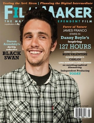
This magazine cover can portray mixed connotations as, amongst other things, the colour scheme and the main image are relatively neutral. First of all, the main image is a photograph of actor James Franco. Franco's attire includes a checkered shirt and a simple, black shirt underneath. These items of clothing can portray simplicity and a neutral atmosphere. This may be because the producers of the magazine may want the audience to focus on the text. The facial expression of Franco in this image is also significant as he is smiling, suggesting the neutral theme once again.

The way Franco is looking can also have some significance as he could be looking toward the text, encouraging the audience to read it as it is clearly the focal point. On this occasion the person in the main image is not making eye contact with the audience as the cover lines are significant in explaining the main content of the magazine.

The masthead of the magazine can be seen as childlike as the font is clearly not formal but it could also portray connotations of creativity. The colour scheme also blends with the colours used in fonts further down the magazine in cover lines. These colours of the fonts stress significance of their meaning, for example the name "Danny Boyle" and "127 Hours" are in the same colour and font as they are linked. The word "inspiring" is in a different, less significant font as it is purely describing the film. The size of the font can also portray meaning as it can stress significance; the larger the font, the more significant the language.

The cover lines are all placed around the main image; none of them invade the image as it can disrupt the effect the image is trying to portray. The image is aligned using the rule of thirds as it is the most effective way of displaying an image that is most aesthetically pleasing to the audience. This also allows room for the cover lines in the empty space. The barcode is also situated at the bottom right corner of the cover as this way it is positioned out of the way and therefore it doesn't disrupt the main image or the cover lines.

The socio-economic group for this magazine may be placed at around C1-A as the magazine is priced higher than the rest I have analysed and can be seen as formal compared to them. The price of this magazine can be as high as £5. This suggests the magazine is designed to attract a more formal and sophisticated audience.

Friday, 17 October 2014

Textual Analysis - Total Film

Textual Analysis - Total Film


This Total Film magazine cover showcases the film "X-Men: Days of Future Past." This is evident not only because it states it in the cover lines but more obviously the main image. In this case the masthead of the magazine is behind the main image. This is usually the case but in the last analysis the magazine was a special edition so it was different. The key theme to this cover is that everything is central. The masthead, the main image and all of the cover lines are central; portraying connotations of formality and seriousness.

The use of dark colours also stresses this dignified theme. The facial expressions of the actors in the main image also express this as they are all looking toward the audience; with the exception of one on the left. This has some significance because it briefly explains how the characters will behave in the film. We can take from this that the character on the left has some significance as he is different to the others.

The cover lines are all situated at the bottom of the cover, this is due to the fact all of the characters in the main image are important and therefore we need to see their attire and body language. The cover lines are used to persuade the reader to read the magazine and question what is inside. The font scales with level of language importance.

A good example of this on this magazine would be "Future 100" as it ensures the audience will see it and therefore they will question it. The use of the enigma code will ensure the reader is invited to read it. The bright white font is bold and clear to ensure it can be red with ease. If it wasn't that clear people would be put off and wouldn't be as intrigued.

The language used is also significant because of the affect it has on the audience. An example of this on this cover would be "your essential preview to everything that matters in movies." If someone who is interested in film reads this they will feel the need to read it as they believe it is "essential" and they will want to know "everything that matters in movies." This clever use of persuasive language encourages the reader to purchase the magazine.

The colour scheme for this cover is significant because it is consistent throughout and it can portray connotations of clarity but also high ranking. It also blends with the characters' attire. Four of the five characters are wearing black clothing. The reason for the fifth character, the one on the left, not wearing black relates to his role in the film. He is the different character, he acts differently and we can extract this from the front cover.

The socio-economic grouping for this magazine may be placed at C1 up to B as the price can be set around £3-£4 for this magazine on average. We know this range in the socio-economic grouping would be suited for this magazine as these are the people that would be willing to spend this amount on a magazine. We can also tell this as the language used could be quite advanced. The only problem with this summarisation would be some of the audience may fit into the C2 - D grouping range as the magazine may be bought for them but they may have an interest in it. 

Thursday, 16 October 2014

Textual Analysis - Empire Magazine

Textual Analysis - Empire Magazine


This magazine cover is a prime example of a magazine that captivates and invites it's audience. The masthead for this magazine differs from others as it covers the main image; mastheads usually sit behind the main image. This could be because title isn't as well known as others such as GQ or Vogue but it could also be because the magazine needs the promotion as it is not as popular as others. The striking, bold red font portrays connotations of importance of the magazine. The font is not formal but it also isn't informal, it is a neutral medium in-between. The theme of this magazine is set by the content; the film "Tron Legacy" is being showcased. This has resulted in a change in font at the top of the magazine. The colour and style of the font suits the film and this could promote the film further.

This brings me to the main image; in this case it is one of the main characters in the film. The character is played by actor Jeff Bridges. The image is central and eye contact is created with the audience. This could create a bond between the audience and the character in the main image; therefore inviting them to buy the magazine. The facial expression of the character in the image could also portray the message of the film so we have a slight idea of the genre without having any prior knowledge to the film.

We can clearly see the film is not a comedy due to the formality and the colour scheme; the colours could suggest sci-fi. The choice of actor to put on the magazine cover is significant as it could suggest the level of formality for the film; an older figure could portray connotations of wiseness and knowledge. We can also take from this the character's role in the film. The enigma code is used here to ask the audience questions about the film, they will question what is going on and therefore they will either want to buy the magazine or watch the film.

The cover lines are evenly spread around the main image so that information about the content of the magazine is addressed but the main image is not covered to the point that it cannot be seen properly. The font used is the same as the masthead as this continues the formal yet creative theme of the magazine. The colours of the fonts are significant as they capture the reader's attention as they are bright and vivid but they also fit the colour scheme of the film. The yellow font could alarm the reader and invite them to read the heading and therefore encouraging them to continue reading. The language of the cover lines needs to be concise but it also needs to persuade the audience to read on.

Certain information is given but it is used in a way that it ensures the reader questions it. An example of this on this magazine cover would be "How was your 2010?" By addressing the audience directly in a way that ensues conversation can make them think about the question in hand. This creates a bond between the audience and the magazine as it is almost like they are having conversation. Language like "The ultimate guide" and "magazine of the year" can promote the magazine and once again persuade the audience to read on. The inclusion of well-known celebrities names such as Johnny Depp and Angelina Jolie can motivate people to read about them as they are interested in the films that they star in.

The socio-economic grouping of this magazine can be difficult to analyse as there is a wide age range that could be targeted. The price of the magazine is not displayed but the average price for Empire magazines is around £3.59. This could put the socio-economic grouping for this magazine at groups C1 and above; up to B as group A may be interested in higher quality magazines.

Survey Monkey - Film Magazine Survey

Survey Monkey - Film Magazine Survey


https://www.surveymonkey.com/s/2BJMD2R 

Friday, 10 October 2014

Examples of Representation in the Media

Examples of Representation in the Media

This is an example of the upper class in the media. In the image we can see the UK leaders being portrayed and represented as being powerful. In the image we can see they are well dressed and well groomed. This gives connotations of responsibility and formality. This was found on the homepage of BBC News, meaning this is one of the most important topics at the time in this country. The facial expressions of the men in the image gives the reader an idea of what the topic is about; issues in the governing of the country. This is a positive representation of men in the media.


This is one representation of men in the media, the programme Insane Fight Club. Found in the category TV on the BBC website, the image shows 3 men who are involved in a fighting club and subculture. The image shown gives connotations of crazy and mad men. The clothing they are wearing in the image is all black and the men can be seen wearing tattoos. These features also give connotations of insanity. The programme represents the men in a negative way. They are portrayed as crazy and the people involved are portrayed as crazy and mental. Warnings are displayed before the show telling the audience that there is strong language and scenes "you may find upsetting." This is then followed by a sarcastic comment about the fighter's sanity, this is used because it amuses the audience but it also gives them an idea of how the men behave in the show.


The film Lucy includes actors Scarlett Johansson and Morgan Freeman. This is significant because they are two contrasting people. Morgan Freeman is a black, older male and Scarlett Johansson is a young, white female. In the film. The scientists are all male and they are all older, this could be a stereotype towards scientists. Johansson is portrayed as a white, blonde woman in her mid twenties at the beginning of the film, her dress sense is casual throughout the film. This is important because people may connect and relate with this; making the film more believable. Another reason why Johansson may have been selected for this role is because she has been voted sexiest woman alive for the second time by Esquire. This could also be another marketing technique as there could be shots in the film that could be revealing; this would encourage people to go and see the film. Another that Morgan Freeman was chosen to play the part of the scientist could be how he is older and this could have connotations of being wise.


South Park stereotypes race very much so. Comments are made by the characters in the show that could be deemed racist but manage to remain in the boundaries of social acceptance. Strong stereotypes are made in the show, especially those toward race. None of the main characters are black and few other characters in the show are black but when they are shown in an episode they are scripted to make comments which could offend. An episode titled "Chef Goes Nanners" includes the black character Chef and his protest against the South Park flag because he thinks it is racist. This episode could have deeper meaning and could be in response to the audience of the show complaining about racism. The message behind the episode is that by pointing out racism it makes you racist yourself.


The programme My Big Fat Gypsy Wedding highly sexualises women and girls. No matter the age of the girls doesn't appear to matter to the families involved. Although this is how the girls are represented in the programme it doesn't mean that this is how they act. The programme highlights the negative side of the families and how they act but it doesn't include the positive side of what they say. Just because the girls are dressed like this and the way they behave it doesn't mean they don't have morals. Some of the girls, for example, save themselves for their husband. Someone who watches the show would not think this due to the representation of the girls. The things they wear, the way they behave on camera and the language they use doesn't portray this message. There is no doubt, however, that the women in the programme are highly sexualised in a certain way to gain an audience; this could also be a marketing technique.

Thursday, 9 October 2014

Textual Magazine Analysis - GQ

Magazine Analysis - GQ


This magazine cover portrays connotations of formality and masculinity. Although Drake could be used to attract a female audience, the male audience could also aspire to be like him. Also the matter that Drake is a well known artist could attract a wide audience as they would like to read about him. By quoting one of his most famous songs "started from the bottom now he's here" the magazine relates to the audience. This is important because it could encourage the audience to read on. At first glance the magazine looks relatively formal but upon further inspection at the cover lines we understand that the age range could vary from late teens to early thirties. We can get this information from the language used, a "killer summer party" may relate to a twenty to thirty-year-old audience.

Drake is seen wearing bright clothing, the silver coloured top and the white trousers could signify cleanliness and spruceness. This could give the male audience something to look up to, something to aspire to be like. The wrist wear could signify wealth and prosperity; the watch is made out of gold and encrusted with what looks like diamonds. His necklace could also give these connotations. His facial expression could also portray connotations of friendliness and this could encourage the audience to feel at ease when reading about him; they feel he is more realistic and down-to-earth. 

The masthead on this magazine is portrays connotations of minimalism and clarity, however it can still be recognised as GQ fairly easily. The cover lines are neatly organised around the main image of Drake to signify the main image itself but to also portray connotations of purity while maintaining legibility. Eye contact is also made with the audience as it gives them a sense of involvement. Drake's body language is also casual, encouraging the audience to feel at ease at the sight of someone famous.

The slogan "look sharp - live smart" gives connotations of formality and wealth. This could also affect the audiences' opinion on the magazine as they may aspire to "look sharp" and "live smart." These are positive aspects that the audience may feel they need to live up to in order to be successful like Drake. The little details down to the fact Drake's shirt is tucked into his trousers gives connotations that he is smartly dressed ready for an occasion.

The socio-economic grouping this magazine's audience could be classed as would be from C2 to B as the average price is set at £3.99. This is significant because it tells us who can afford the magazine and we can compare this to the age range targeted. The cover line "50 under $50" could tell us that the audience is willing to spend up to $50 (£31) on clothes for the "best summer wardrobe ever." This can also tell us that the target audience could have a limited amount of money to spend on clothes.