Textual Analysis - Filmmaker Magazine
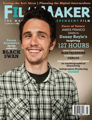
This magazine cover can portray mixed connotations as, amongst other things, the colour scheme and the main image are relatively neutral. First of all, the main image is a photograph of actor James Franco. Franco's attire includes a checkered shirt and a simple, black shirt underneath. These items of clothing can portray simplicity and a neutral atmosphere. This may be because the producers of the magazine may want the audience to focus on the text. The facial expression of Franco in this image is also significant as he is smiling, suggesting the neutral theme once again.
The way Franco is looking can also have some significance as he could be looking toward the text, encouraging the audience to read it as it is clearly the focal point. On this occasion the person in the main image is not making eye contact with the audience as the cover lines are significant in explaining the main content of the magazine.
The masthead of the magazine can be seen as childlike as the font is clearly not formal but it could also portray connotations of creativity. The colour scheme also blends with the colours used in fonts further down the magazine in cover lines. These colours of the fonts stress significance of their meaning, for example the name "Danny Boyle" and "127 Hours" are in the same colour and font as they are linked. The word "inspiring" is in a different, less significant font as it is purely describing the film. The size of the font can also portray meaning as it can stress significance; the larger the font, the more significant the language.
The cover lines are all placed around the main image; none of them invade the image as it can disrupt the effect the image is trying to portray. The image is aligned using the rule of thirds as it is the most effective way of displaying an image that is most aesthetically pleasing to the audience. This also allows room for the cover lines in the empty space. The barcode is also situated at the bottom right corner of the cover as this way it is positioned out of the way and therefore it doesn't disrupt the main image or the cover lines.
The socio-economic group for this magazine may be placed at around C1-A as the magazine is priced higher than the rest I have analysed and can be seen as formal compared to them. The price of this magazine can be as high as £5. This suggests the magazine is designed to attract a more formal and sophisticated audience.

No comments:
Post a Comment